
For our Capstone Projects, we were challenged to assess a problem and figure out a creative way to solve that problem.
My Capstone Project I chose to highlight something important to me, Canadian Sports, specifically Baseball.
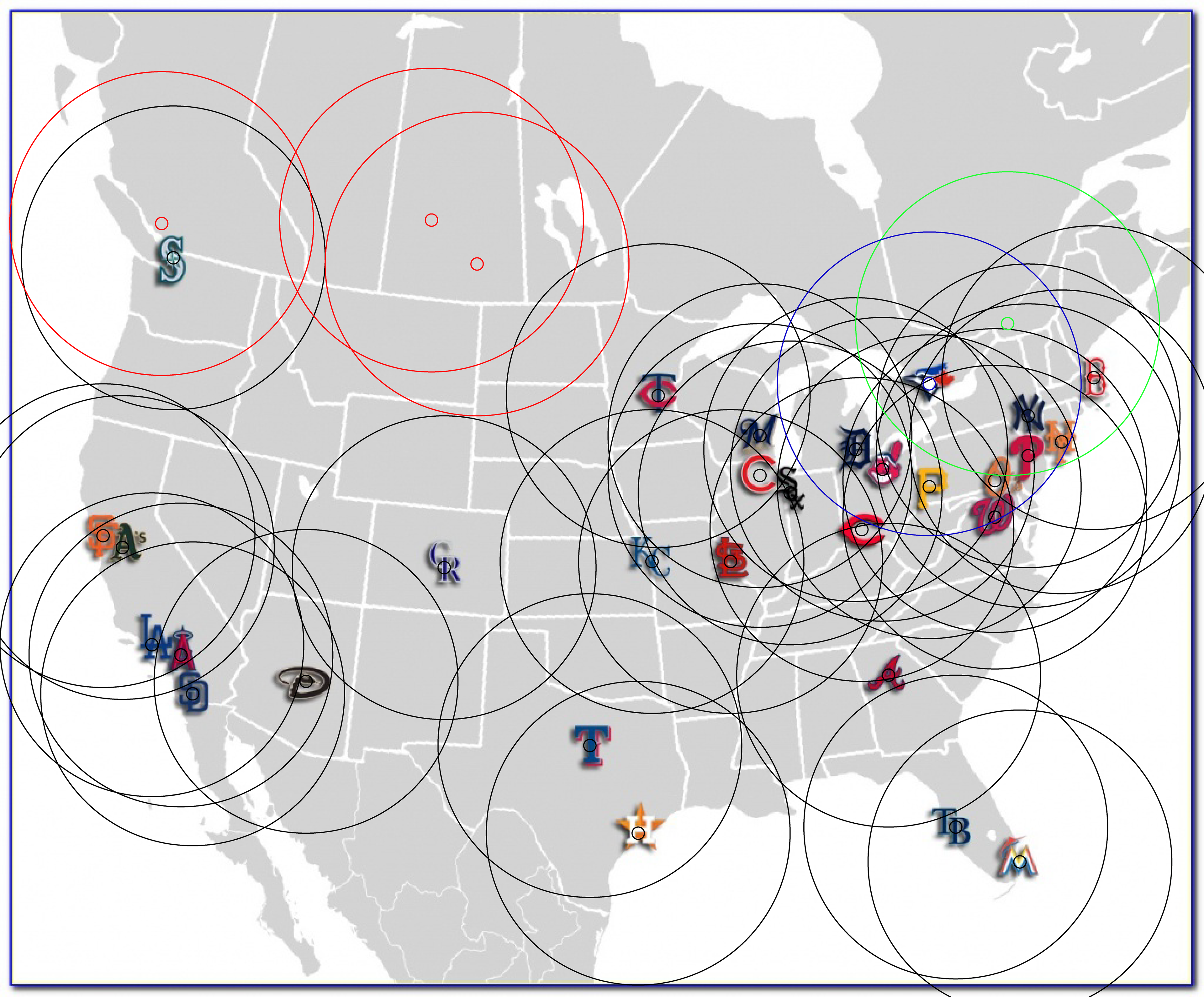
On this map, I have every Major League Baseball team, and a ring around them signifying approximately an 8 hour drive away.
There are a few different circles, Blue signifies the Toronto Blue Jays, Green signifies the now defunct Montreal Expos.
The Red circles are teams that one could potentially put a team in.
Most people, when talking about a second Canadian baseball team, choose Vancouver because of it's size. In my Capstone project, I decided to go a bit more controversial and focus on Location, hereby deciding on either Regina or Saskatoon, as they are the most isolated from the rest of baseball. Ultimately, because of the presence and success of the Saskatchewan Roughriders, I chose Regina.
But in having a new team, you have to have branding for that team, and that is what most of the design work I did for my Capstone entails.
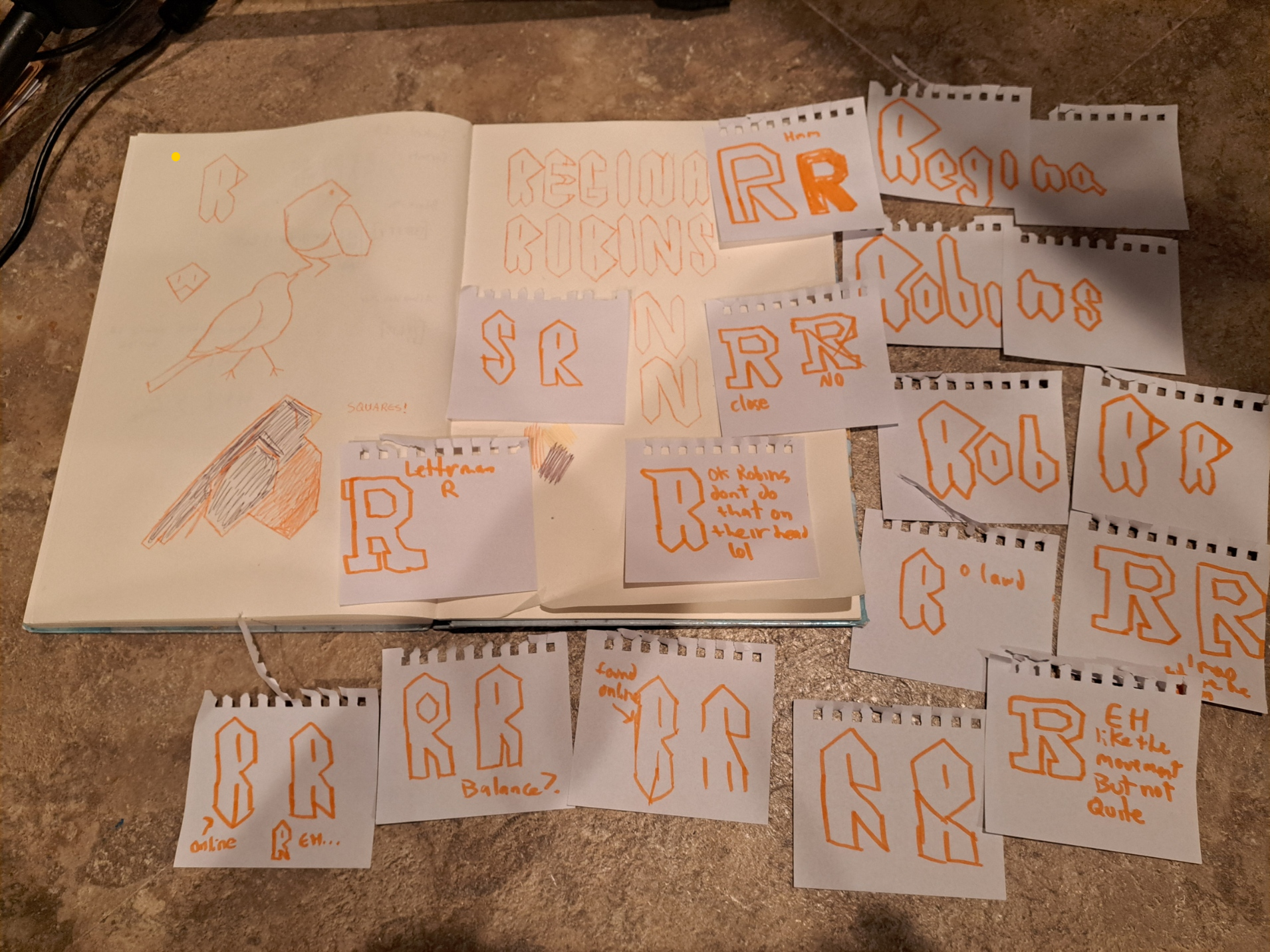

The team name was the first tough bit of decision making. I found myself waffling between something culturally or historically relevant, or something that would lend itself easier to branding, and chose to go for the second option. The alliteration of 'Robins' and the bird motif really spoke to me, even though doing something like 'Regina Cyclones' or 'Regina Knights' also came to mind. Ideally I would have chosen 'Regina Royals', but in the context of Major League Baseball, we already have the Kansas City Royals. Picking Robins would lend itself to a lot of the same marketing opportunities as the Blue Jays or the Cardinals.
Visually, I wanted to focus on marketing my team more towards children and teenagers, as diehard baseball fans are hard to convince to switch team allegiance. Marketing to the children who don't have much of a sports bias would be easier, so I went to the drawing board thinking about designs I liked when I was younger and remembered the 'Cool S', which is what I based my lettering off of.
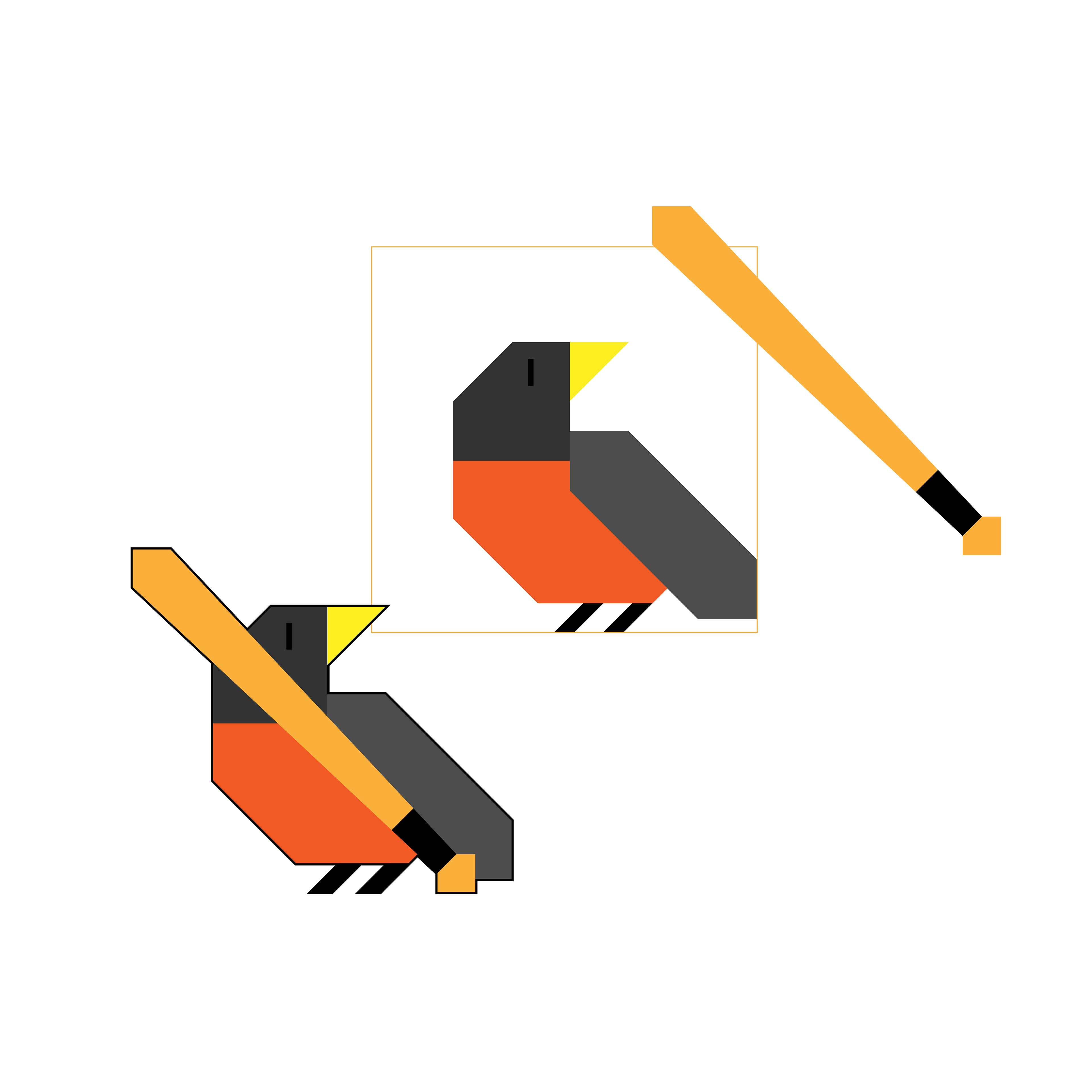
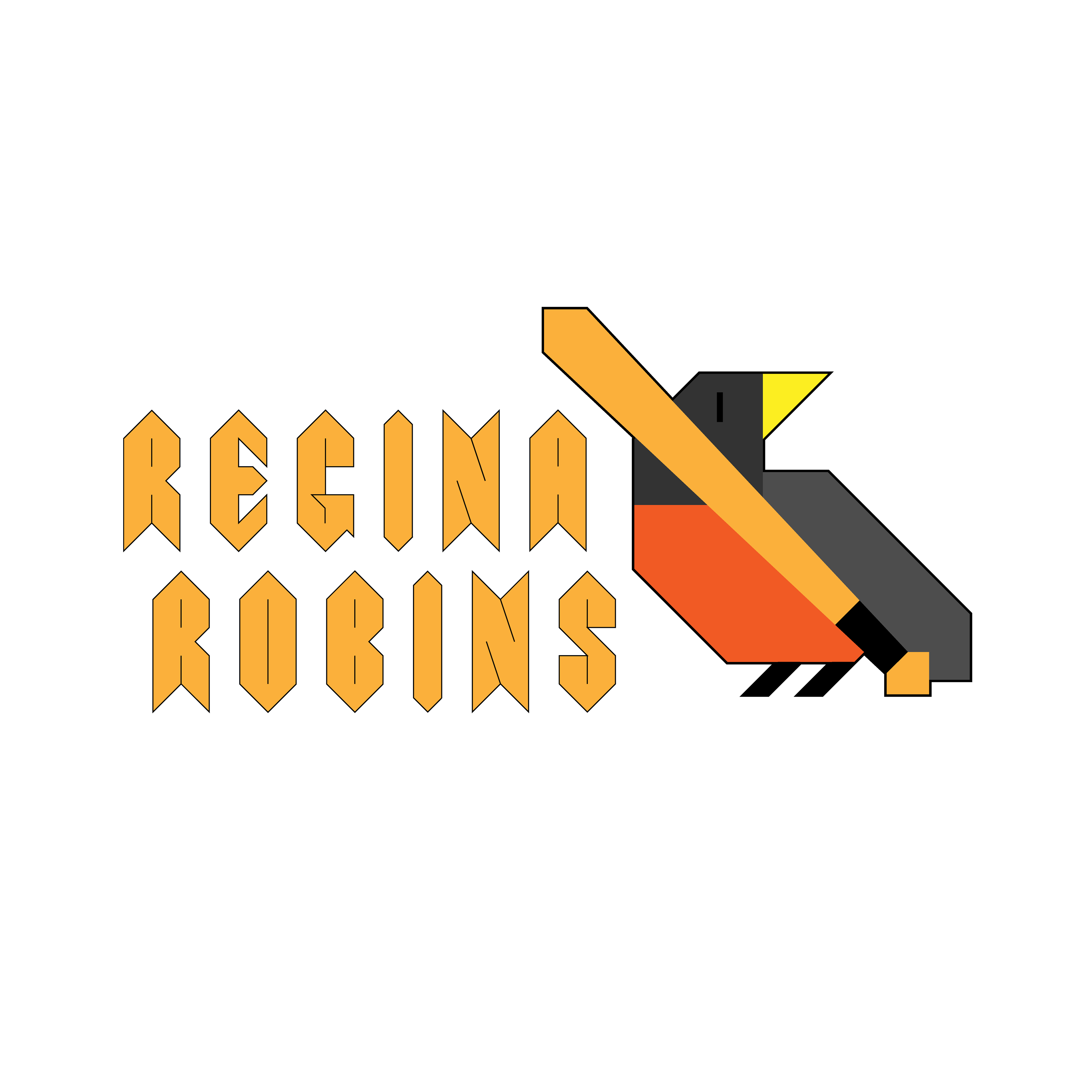
I wanted the bird to carry the same kind of style visually as the lettering. I was somewhat inspired by the Saskatchewan Roughriders logo, in a way, because of the ability to write their logo on a keyboard as /=S=/ and have it still track to a fan, I though a lot about a simple logo, something geometric like the lettering and easy to draw for children.
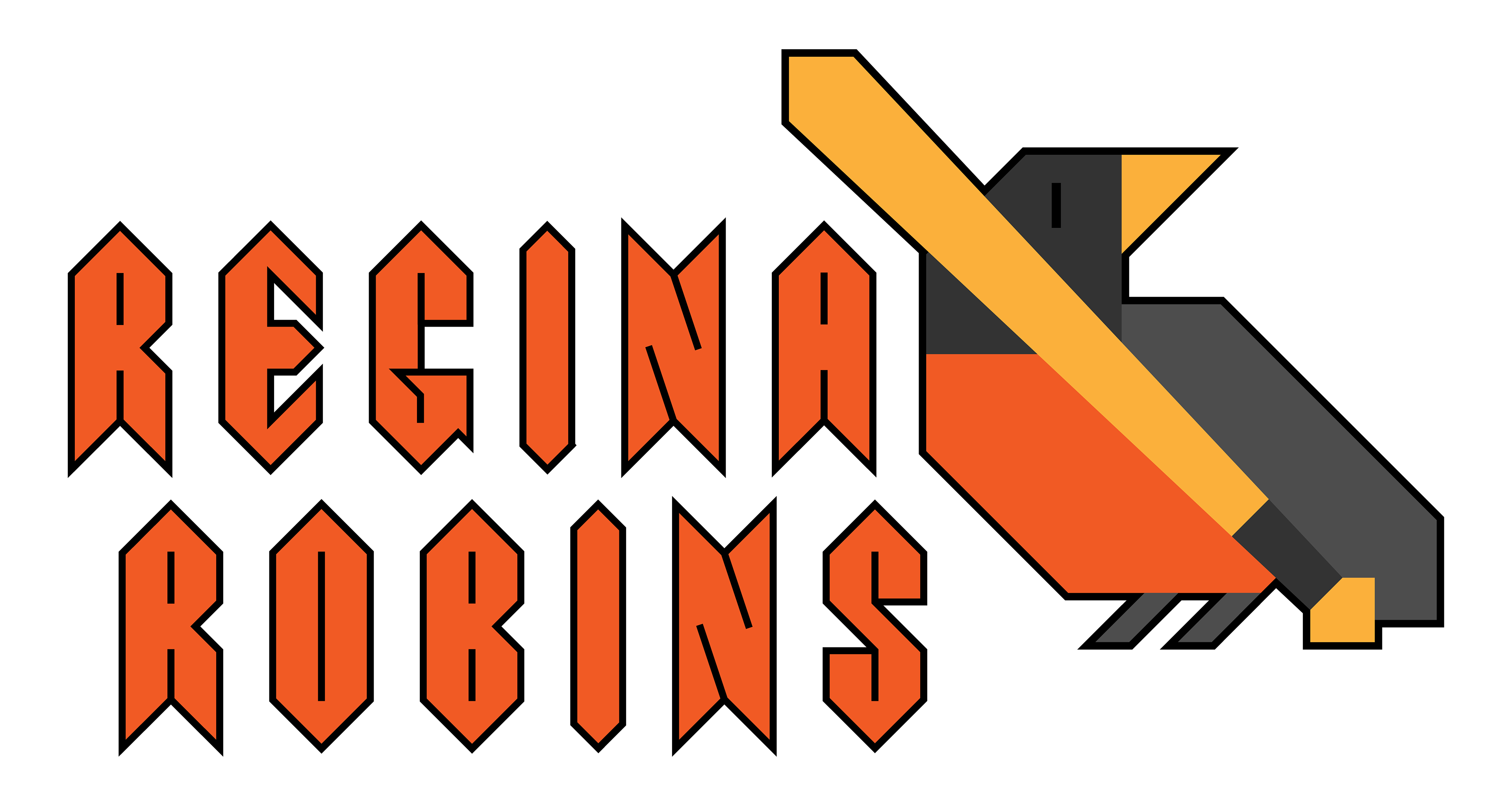
The logo I settled on keeps a stylistic link between the lettering and the logo itself, and would look good on any color background needed. Its visually different from the rest of MLB, but not so heavily that it stands out like a neon sign.
Next, I set out to make some other things a sports team would need, Uniforms and a scorebug
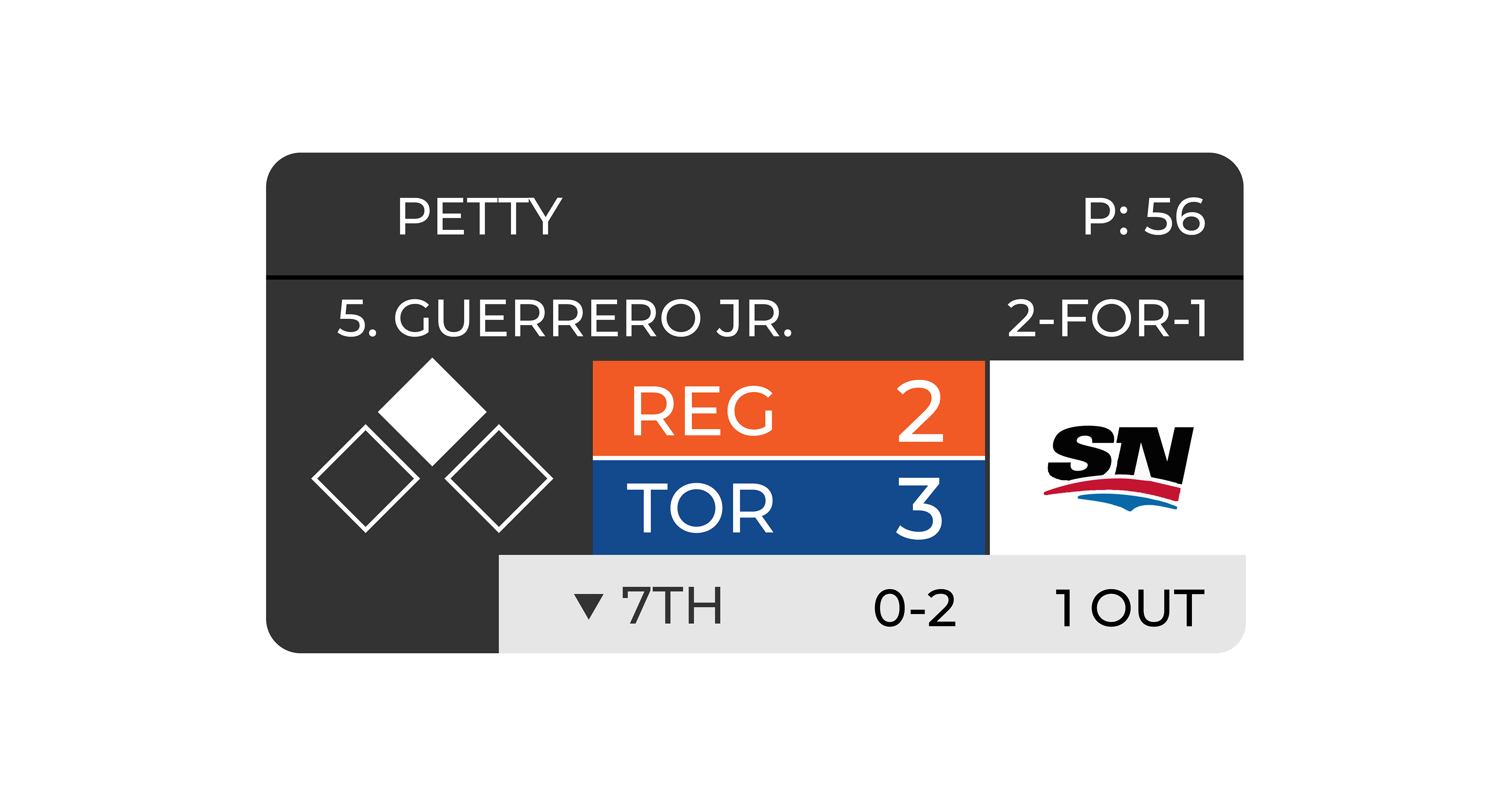
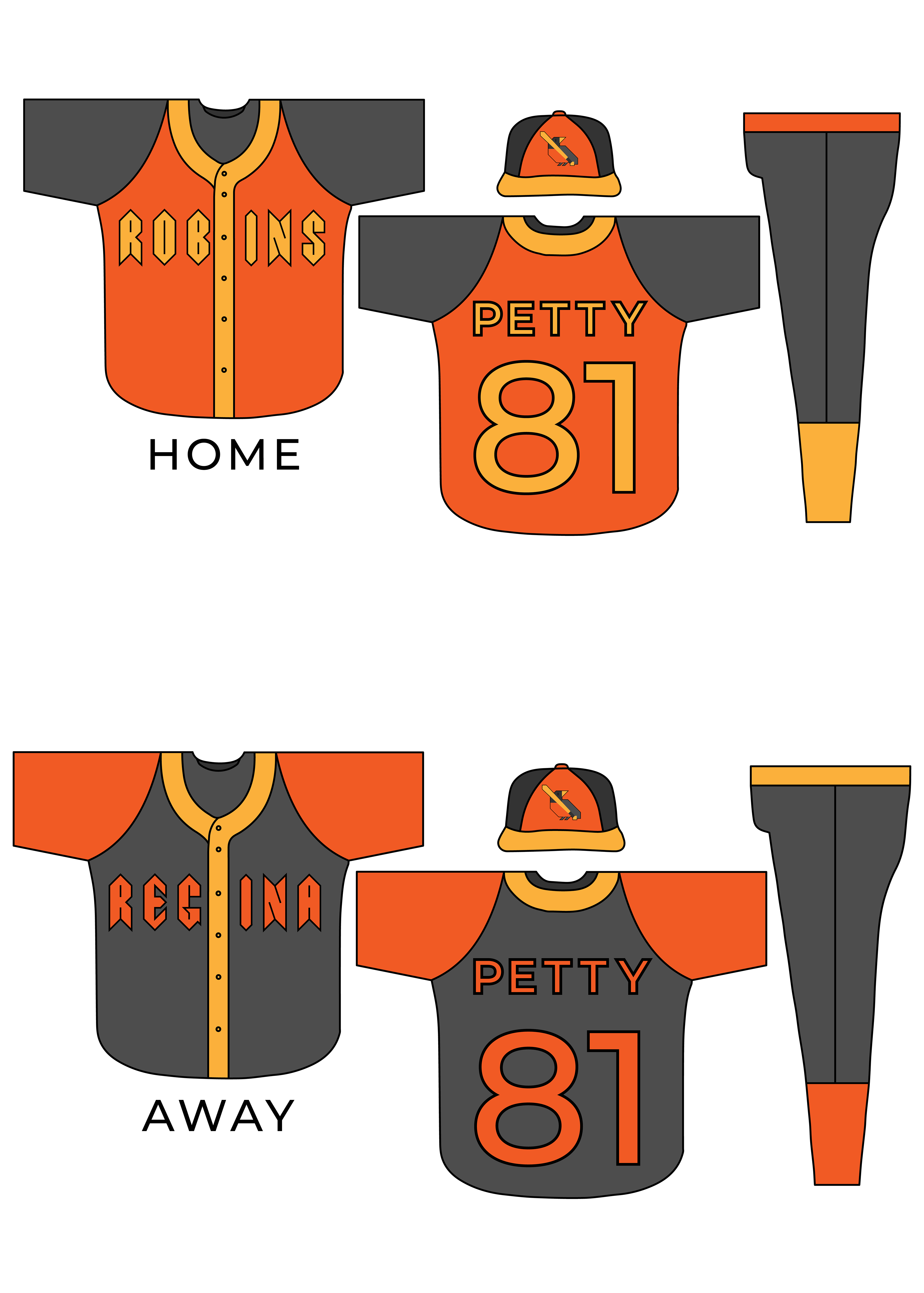
Using a Sample player name, I modeled how a Sportnet brand scorebug would look in action, and made a Home jersey and an Away jersey.
With the jerseys, I really wanted to keep the signature red breast that the robin bird has. Something I also struggle with as a baseball fan, is differentiating team jerseys on the field, so I wanted to create something that followed the simplistic style of official jerseys, but had more color for differentiation.